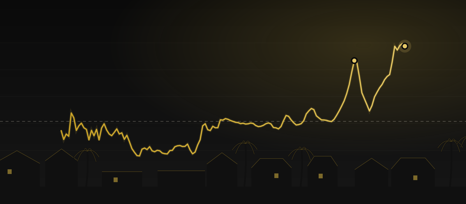
Then two departures — and only one of them has resolved
The first is 2006. Real prices ran to 266.9, roughly 73% above the long-run average, on a wave of loose credit. That one resolved the hard way: by 2012 the index was back to 173.3, having given up every point of the run-up. Anyone who bought at the top and had to sell in that window learned what a real correction feels like.
The second departure is the one we are living in. Since 2020 the index has gone from 241 to a 2025 high of 298.2 — about 94% above the long-run average and roughly 10% above the 2006 peak in real terms. Whether that resolves like 2006 did, or holds as a genuine repricing driven by a decade of underbuilding and demographics, is the honest open question. I do not know, and neither does anyone selling you certainty.
The first departure · 2006
266.9
Roughly 73% above the long-run average. By 2012 the index was back to 173.3.
The second departure · 2025 high
298.2
About 94% above the long-run average and roughly 10% above the 2006 peak in real terms.
What I actually take from this
Time in the market beats timing it, but the entry price still matters. The 2006 buyers who held through 2012 are fine today. The ones who had to sell were not. Which group you land in has less to do with the market than with whether your purchase left you room to breathe — reserves, a payment you can carry if income dips, no need to move on someone else’s schedule.
Do not underwrite a rental on appreciation. A century of data says the property may simply track inflation. If the deal only works when the value climbs, it is not a deal — it is a bet. Make it work on rent, on the debt paydown, and on the tax treatment. Let appreciation be the upside you did not need.